This post is an exercise in visualization (plotting line plot and multicolored histogram with -ve and +ve values). We will be using Pandas and Matplotlib libraries.
We are going to do plotting for a week of Nifty50 data from Aug 2017.
import pandas as pd
import matplotlib.pyplot as plt
import matplotlib.dates as mdates
%matplotlib inline
from dateutil import parser
df = pd.read_csv("files_1/201708.csv", encoding='utf8')
df['Change'] = 0
prev_close = 10114.65
def gen_change(row):
global prev_close
if row.Date == '01-Aug-2017':
rtn_val = 0
else:
rtn_val = round(((row.Close - prev_close) / prev_close) * 100, 2)
prev_close = row.Close
return rtn_val
df.Change = df.apply(gen_change, axis = 1)
We will plot for only a few dates of Aug 2017:
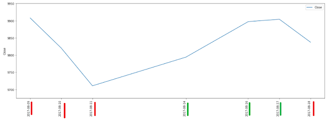
Line plot:
subset_df = df[6:13]
plt.figure()
ax = subset_df[['Date', 'Close']].plot(figsize=(20,7))
ax.set_xticks(subset_df.index)
ax.set_ylim([9675, 9950])
ticklabels = plt.xticks(rotation=90)
plt.ylabel('Close')
plt.show()
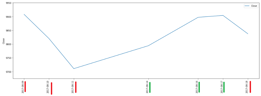
Multicolored Histogram for Negative and Positive values
negative_data = [x if x < 0 else 0 for x in list(subset_df.Change.values)]
positive_data = [x if x > 0 else 0 for x in list(subset_df.Change.values)]
fig = plt.figure()
ax = plt.subplot(111)
ax.bar(subset_df.Date.values, negative_data, width=1, color='r')
ax.bar(subset_df.Date.values, positive_data, width=1, color='g')
ticklabels = plt.xticks(rotation=90)
plt.xlabel('Date')
plt.ylabel('% Change')
plt.show()
 Link to data file: Google Drive
Saturday, June 20, 2020
An exercise in visualization (plotting line plot and multicolored histogram with -ve and +ve values)

Subscribe to:
Post Comments (Atom)
No comments:
Post a Comment