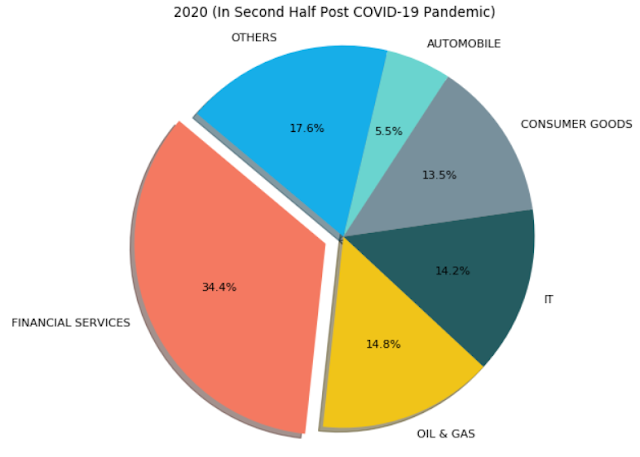
In this post we draw Pie plots, Bar charts and Grouped Bar Chart to visualize how top-5 sectors of Nifty50 have changes after last three market crashes:Drawing the Pie plots
import pandas as pd import matplotlib.pyplot as plt pd_00 = pd.DataFrame({ "Sector": ['CONSUMER GOODS', 'OIL & GAS', 'IT', 'FINANCIAL SERVICES', 'PHARMA'], "Weightage": [27.5, 24.2, 12.2, 10.1, 7.2] }) pd_08 = pd.DataFrame({ "Sector": ['OIL & GAS', 'TELECOM', 'FINANCIAL SERVICES', 'POWER', 'CONSTRUCTION'], "Weightage": [19.3, 9.7, 8.9, 5.5, 3.6] }) pd_20 = pd.DataFrame({ "Sector": ['FINANCIAL SERVICES', 'OIL & GAS', 'IT', 'CONSUMER GOODS', 'AUTOMOBILE'], "Weightage": [34.4, 14.8, 14.2, 13.5, 5.5] }) def add_others_col(df): return pd.concat([df, pd.DataFrame({'Sector': ['OTHERS'], 'Weightage': [(100 - sum(df.Weightage.values))] })], axis = 0) pd_00 = add_others_col(pd_00) pd_08 = add_others_col(pd_08) pd_20 = add_others_col(pd_20) def plot_pie(labels, sizes, title = ""): colors = ['#f47961', '#f0c419', '#255c61', '#78909c', '#6ad4cf', '#17aee8', '#5c6bc0', '#444b6e', '#ef4c60', '#744593', '#ee5691', '#9ccc65', '#708b75', '#d1cb65', '#0d8de1', '#a4554b', '#694f5d', '#45adb3', '#26a69a', '#bdc7cc', ] colors = colors[0:len(labels)] explode = (0.1, 0, 0, 0, 0, 0, 0, 0, 0, 0, 0, 0, 0, 0, 0, 0, 0, 0, 0, 0) # explode 1st slice explode = explode[0:len(labels)] # Plot plt.figure(num=None, figsize=(9, 7), dpi=80, facecolor='w', edgecolor='k') plt.pie(sizes, explode=explode, labels=labels, colors=colors, autopct='%1.1f%%', shadow=True, startangle=140) plt.title(title) plt.axis('equal') plt.show() plot_pie(pd_00.Sector.values, pd_00.Weightage.values, '2000 (Dot Com Bubble)') plot_pie(pd_08.Sector.values, pd_08.Weightage.values, '2008 (Lehman Crisis)') plot_pie(pd_20.Sector.values, pd_20.Weightage.values, '2020 (In Second Half Post COVID-19 Pandemic)')
Drawing the Bar Charts
def plot_bar_graph(categories, values, title = "", xlabel = 'Sectors', ylabel = 'Weightage', figsize = (10, 8)): colors = ['#f47961', '#f0c419', '#255c61', '#78909c', '#6ad4cf', '#17aee8', '#5c6bc0', '#444b6e', '#ef4c60', '#744593', '#ee5691', '#9ccc65', '#708b75', '#d1cb65', '#0d8de1', '#a4554b', '#694f5d', '#45adb3', '#26a69a', '#bdc7cc', ] colors = colors[0:len(categories)] fig = plt.figure(figsize = figsize) ax = fig.add_axes([0,0,1,1]) barlist = ax.bar(categories, values) for i in range(len(barlist)): barlist[i].set_color(colors[i]) plt.xticks(rotation=70) plt.title(title) plt.xlabel(xlabel) plt.ylabel(ylabel) plot_bar_graph(pd_00.Sector.values, pd_00.Weightage.values, title = '2000 (Dot Com Bubble)', figsize = (7, 5)) plot_bar_graph(pd_08.Sector.values, pd_08.Weightage.values, title = '2008 (Lehman Crisis)', figsize = (7, 5)) plot_bar_graph(pd_20.Sector.values, pd_20.Weightage.values, title = '2020 (In Second Half Post COVID-19 Pandemic)', figsize = (7, 5))
Drawing the Grouped Bar Charts
import matplotlib import matplotlib.pyplot as plt import numpy as np def autolabel(rects, ax): """Attach a text label above each bar in *rects*, displaying its height.""" for rect in rects: height = rect.get_height() ax.annotate('{}'.format(height), xy=(rect.get_x() + rect.get_width() / 2, height), xytext=(0, 3), # 3 points vertical offset textcoords="offset points", ha='center', va='bottom') def plot_grouped_bar_graph(xlabels, values, group_lables): x = np.arange(len(values[0])) # the label locations width = 0.2 # the width of the bars fig, ax = plt.subplots() rects = [] for i in range(len(group_lables)): rects += [ax.bar(x + (i * width), values[i], width, label = group_lables[i])] # Add some text for labels, title and custom x-axis tick labels, etc. ax.set_ylabel('Weightage') ax.set_title('Nifty50 Composition as Industry Sectors Across Market Crashes') ax.set_xticks(x) ax.set_xticklabels(xlabels) ax.legend() for i in range(len(rects)): autolabel(rects[i], ax) fig.tight_layout() plt.show() group_lables = ['OIL & GAS', 'FINANCIAL SERVICES'] plot_grouped_bar_graph( xlabels = ['2000', '2008', '2020'], values = [ [pd_00[pd_00.Sector == 'OIL & GAS']['Weightage'].values[0], pd_08[pd_08.Sector == 'OIL & GAS']['Weightage'].values[0], pd_20[pd_20.Sector == 'OIL & GAS']['Weightage'].values[0]], [pd_00[pd_00.Sector == 'FINANCIAL SERVICES']['Weightage'].values[0], pd_08[pd_08.Sector == 'FINANCIAL SERVICES']['Weightage'].values[0], pd_20[pd_20.Sector == 'FINANCIAL SERVICES']['Weightage'].values[0]] ], group_lables = group_lables ) The two sectors that have continued to be in top 5 across these years are 'Oil and Gas' and 'Financial Services':
Pages
- Index of Lessons in Technology
- Index of Book Summaries
- Index of Book Lists And Downloads
- Index For Job Interviews Preparation
- Index of "Algorithms: Design and Analysis"
- Python Course (Index)
- Data Analytics Course (Index)
- Index of Machine Learning
- Postings Index
- Index of BITS WILP Exam Papers and Content
- Lessons in Investing
- Index of Math Lessons
- Index of Management Lessons
- Book Requests
- Index of English Lessons
- Index of Medicines
- Index of Quizzes (Educational)
Sunday, July 19, 2020
Plotting changes in Nifty50's top-5 sectors after last three market crashes
Subscribe to:
Post Comments (Atom)


No comments:
Post a Comment