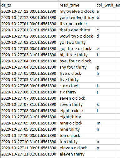
We are creating an HTML based 'Timeline' visual in PowerBI. We have a dataset in Excel file that looks like this:We are going to use Python to add clock icons according to time recorded in "dt_ts" column. Go to "Home >> Transform Data >> Transform >> Run Python Script". Ignore any Privacy warnings that you might get while running script the first time. Code for the "Python Editor": # 'dataset' holds the input data for this script from dateutil.parser import parse def get_icon(x): icon_dict = { "1:0" : "🕐", "2:0" : "🕑", "3:0" : "🕒", "4:0" : "🕓", "5:0" : "🕔", "6:0" : "🕕", "7:0" : "🕕", "8:0" : "🕗", "9:0" : "🕘", "10:0" : "🕙", "11:0" : "🕚", "12:0" : "🕛", "1:30" : "🕜", "2:30" : "🕝", "3:30" : "🕞", "4:30" : "🕟", "5:30" : "🕠", "6:30" : "🕡", "7:30" : "🕢", "8:30" : "🕣", "9:30" : "🕤", "10:30" : "🕥", "11:30" : "🕦", "12:30" : "🕧", } hour = parse(x['dt_ts']).hour min = parse(x['dt_ts']).minute if min >= 0 and min < 30: min = 0 else: min = 30 return icon_dict[str(hour) + ":" + str(min)] dataset['icon'] = dataset.apply(get_icon, axis = 1) The above code creates a new column "icon". Then, "Close and Apply" 'Transform Window' and come back to "Home" tab. There on the right hand side, you can see your 'Sheet1' (Sheet1 in our case, this is the name of your Excel sheet or Database table). Click on "Ellipsis" and "New Column". What we are going to write next is a mix of HTML, CSS and DAX code. HTML = "<p style='font-size: 25px'>" & Sheet1[icon] & ": Message: " & Sheet1[read_time] & "; Char: " & IF( OR(ISBLANK(Sheet1[col_with_empty_cells]), LEN(Sheet1[col_with_empty_cells]) = 0) , "NA", Sheet1[col_with_empty_cells] ) & "</p>" To get the HTML Visual, we get the HTML Visual from GitHub Load the Visual using the downloaded "pbiviz" file. (Ref: PowerBI's HTML Content Visualization) To get the HTML content in the Visual: Either: Drag the column into the 'HTML Content' Visual. Or: Click on the 'Tick' mark before the "HTML" column in the side bar on the right named "Fields". Output:
 References % GitHub Link to PowerBI Notebook and Excel used for this demo % Intergration of Anaconda and PowerBI % Get 'HTML Content Visual' from store.office.com % OR Function DAX (Microsoft) % DAX Operator Reference (Microsoft) % Clock Symbols
Sunday, November 1, 2020
Timeline View Using HTML Content Visual in PowerBI


Subscribe to:
Post Comments (Atom)
No comments:
Post a Comment